A website to highlight AltaMed and its career opportunities to capture prospective employees.
Sensis Agency
UX Designer
SKILLS DEVELOPED
UX, UI, Prototyping, JavaScript
TOOLS USED
Unbounce, Figma, Notion
AltaMed has low awareness among job applicants, but those who are familiar perceive it positively. AltaMed needs to make itself and the available careers more recognizable for incoming healthcare workers.
Create a singular access point for AltaMed careers to build familiarity with AltaMed’s mission and values, health services offerings, locations, and available career opportunities, using a landing page, and subsequently a website to capture prospective employees.
I initiated the process by understanding how prospective employees accessed AltaMed's career page on the current website. I assessed the layout, content, and user flow to identify the main focus and prioritize areas for improvement.
To understand the target audience, AltaMed's goals, and the competitive landscape, I synthesized the recruitment strategy, conducted additional research on AltaMed, and completed a competitive analysis. It was crucial to examine not only healthcare career websites but also career sites from other sectors to identify successful strategies and commonalities. Prospective employees want to know the company's reach, the benefits of working there, and how it can advance their careers.
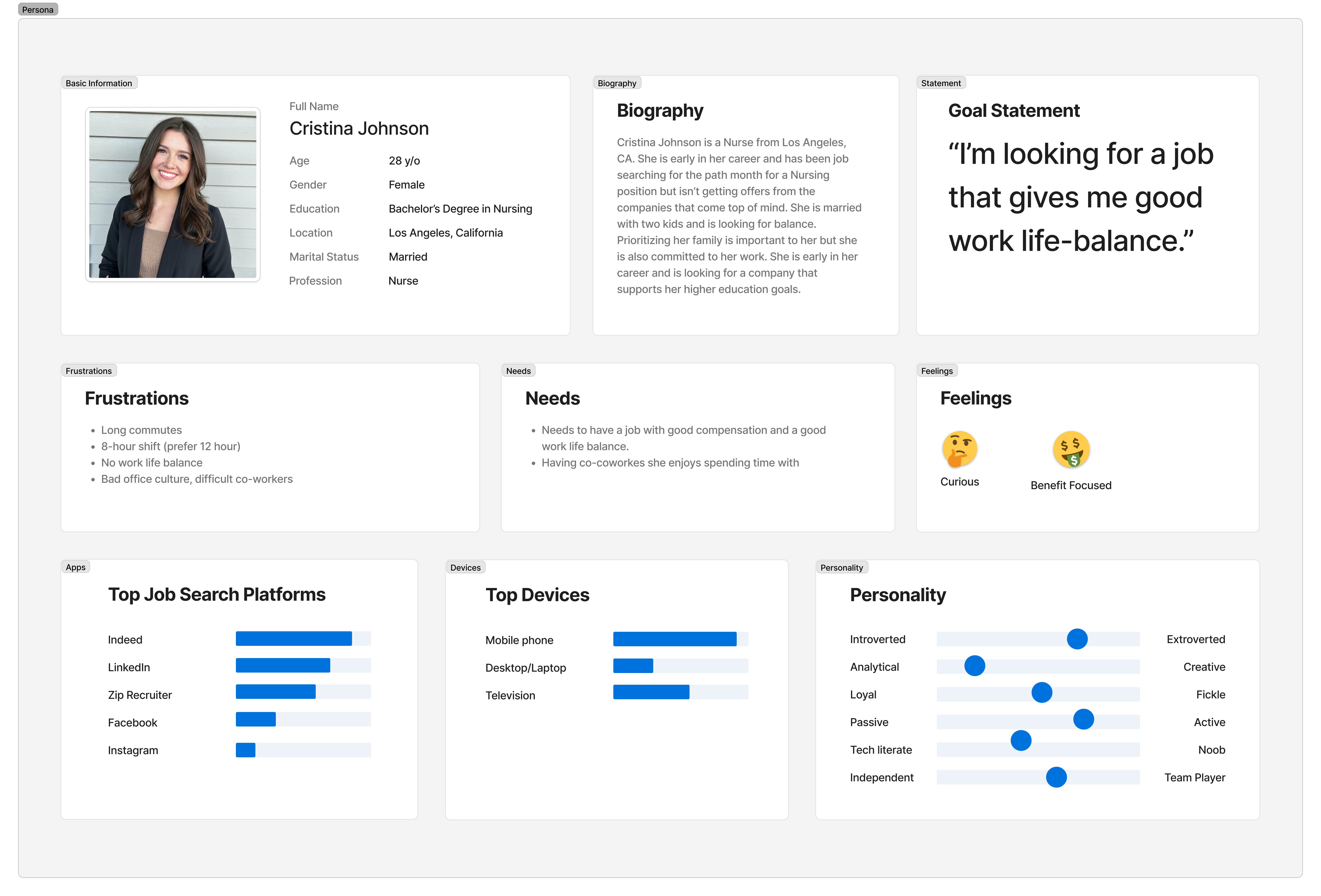
Based on the research, I developed a journey map that highlights the stages from awareness to the post-application process and created a persona for a prospective employee interested in working with AltaMed. This helps me focus my thinking throughout the design process.
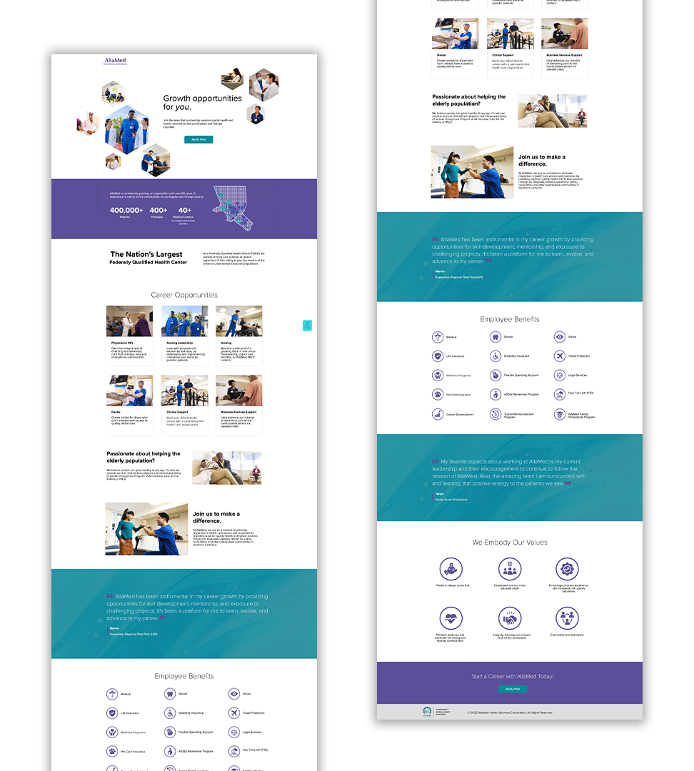
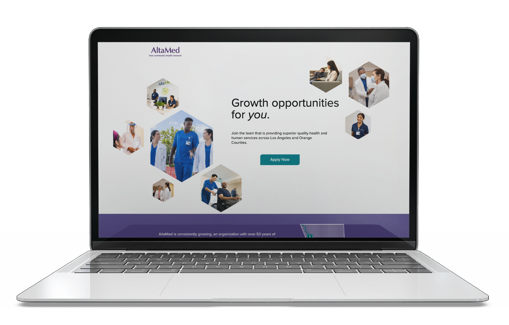
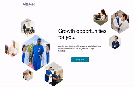
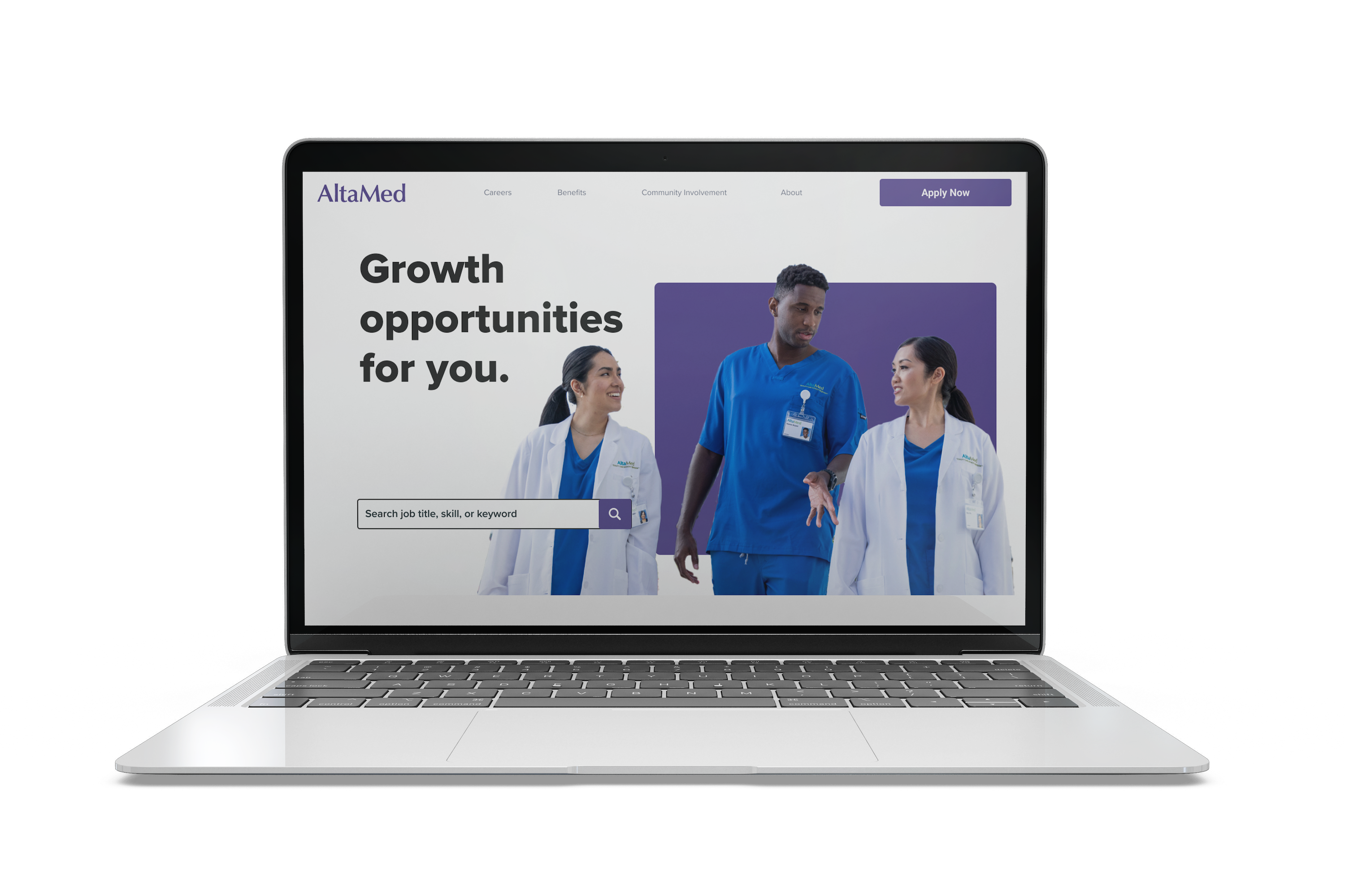
The landing page was set to launch first as the initial point where potential employees could begin searching for information about AltaMed. It was designed to concisely raise awareness of what AltaMed has to offer. The landing page would remain available until the full website launch.
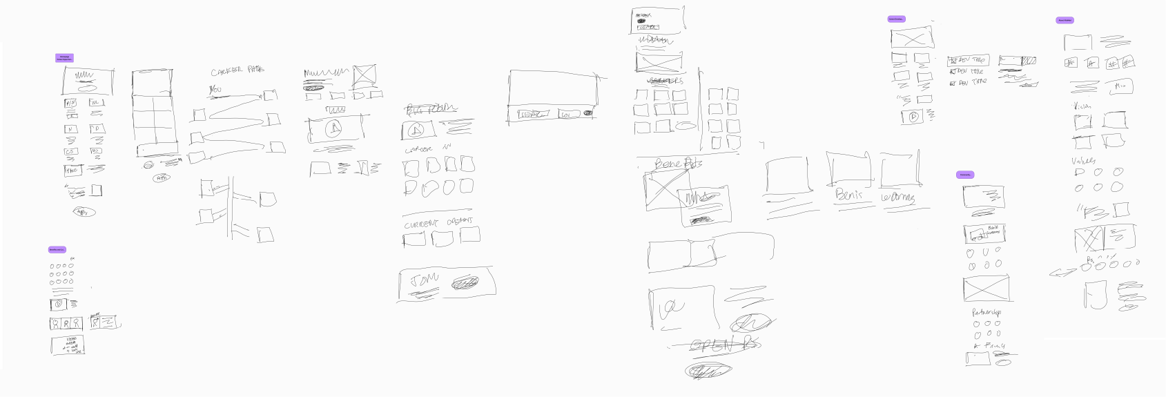
To plan the landing page I created low fidelity wireframes to understand format and test feature placement.
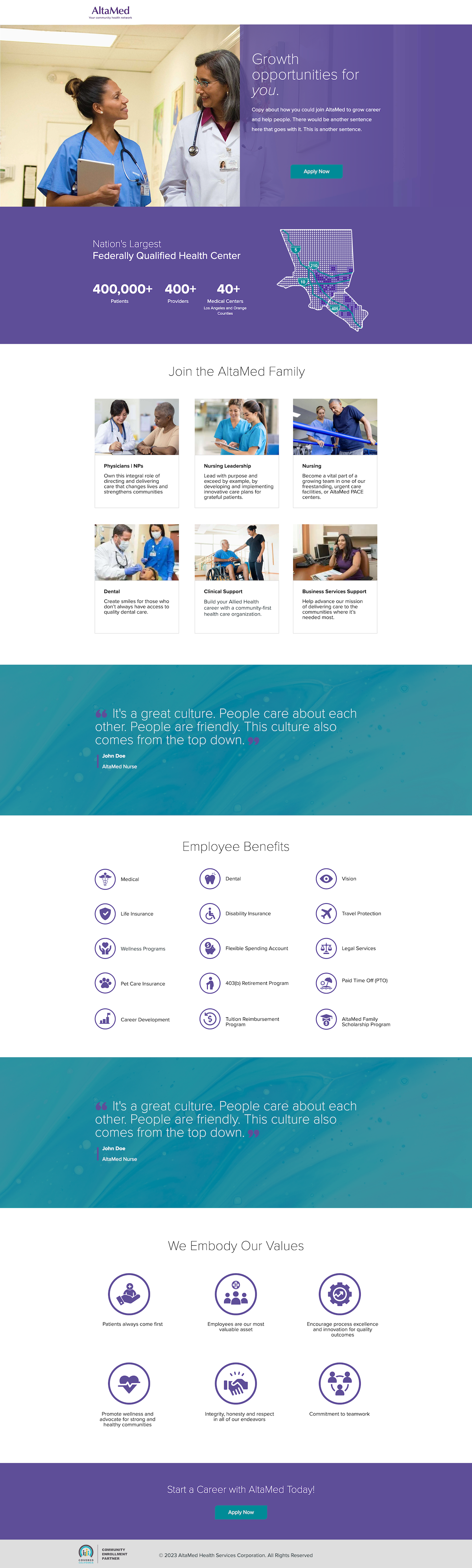
I developed the landing page by incorporating UI elements, imagery, and a color story that aligns with the AltaMed brand while still maintaining a distinctive identity.
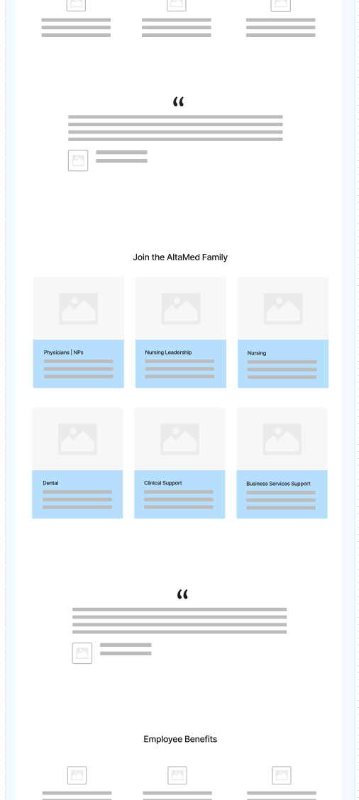
In its early iterations, the landing page featured standard elements.
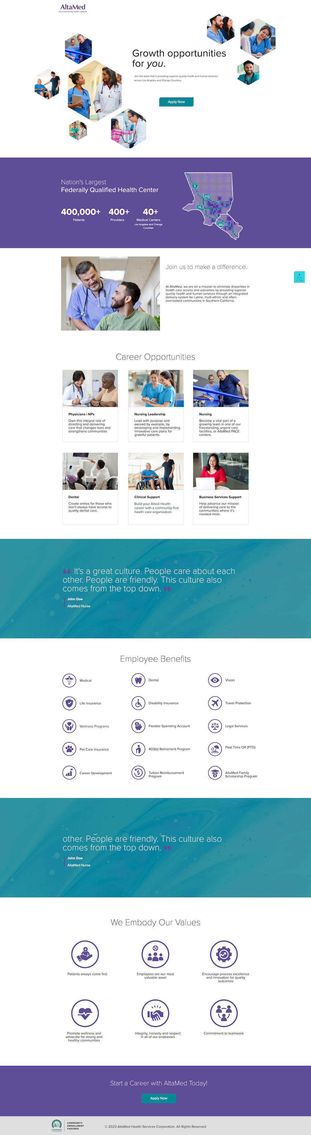
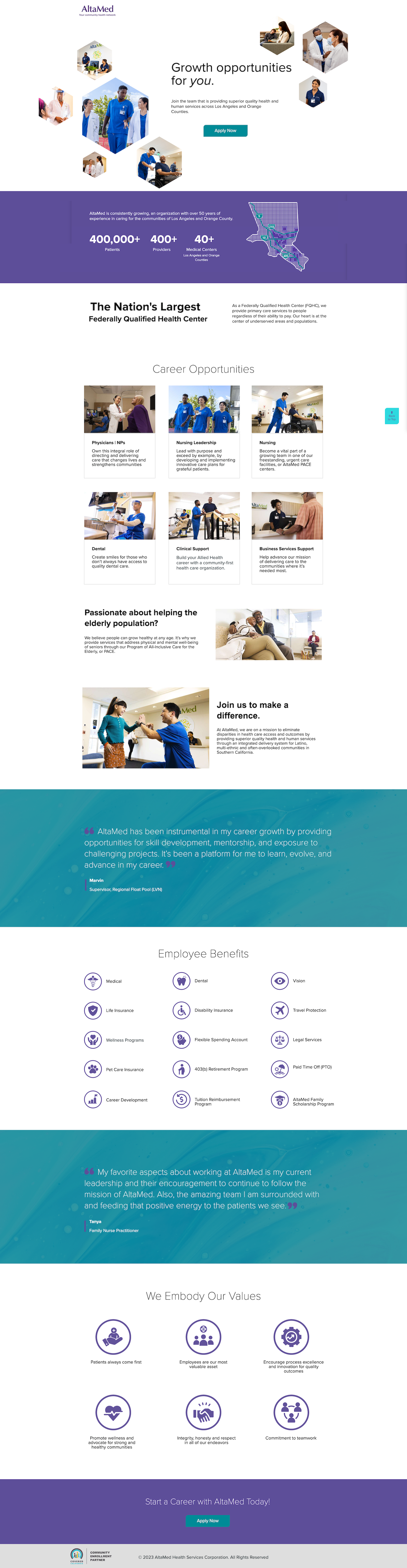
Challenged to create an attention-grabbing landing page, I had to think beyond the typical constraints and ventured outside the box to generate interest in something seemingly simple. To achieve this, I integrated JavaScript to add pulsing 'hexagons' in the hero section, drawing users' attention and highlighting AltaMed employees.

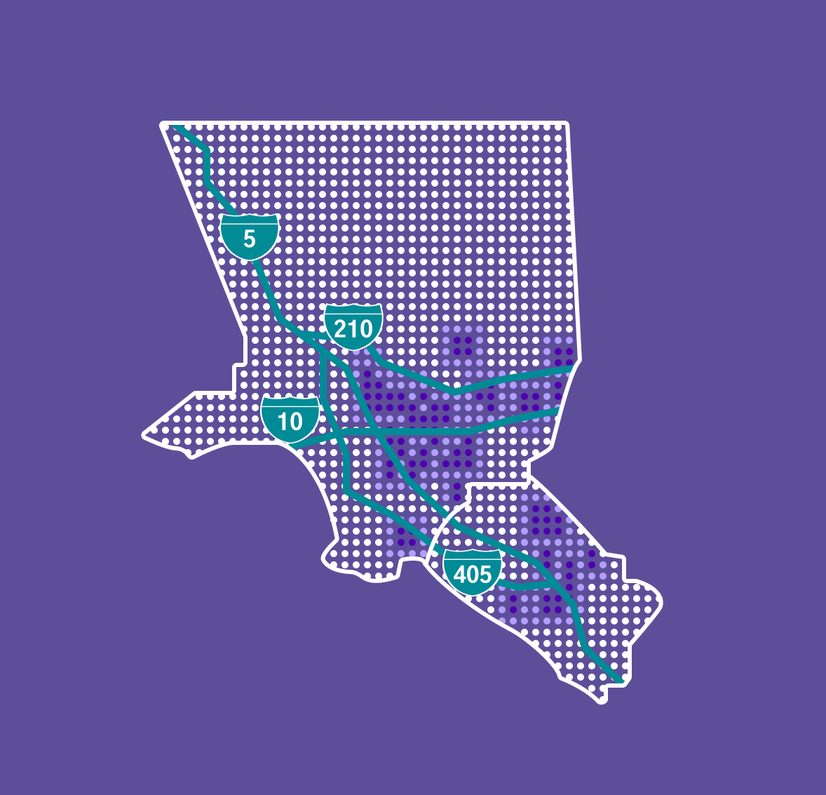
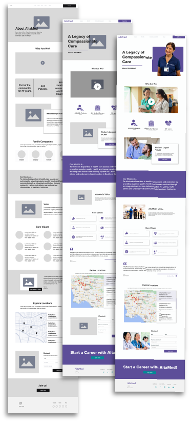
Additionally, I designed a heat map displaying AltaMed locations in Los Angeles and Orange Counties, using freeway maps as contextual clues to the areas.
60% of website traffic worldwide comes from mobile devices; therefore, content prioritization is essential for users to access the most crucial information on smaller screens.
The key areas I needed users to be aware of were:

Since its launch in September, the landing page has garnered over 100,000 visitors and 150,000 views, generating 66k clicks to the Workday application website. It is experiencing a strong pipeline of candidates, particularly LVN Nurses.
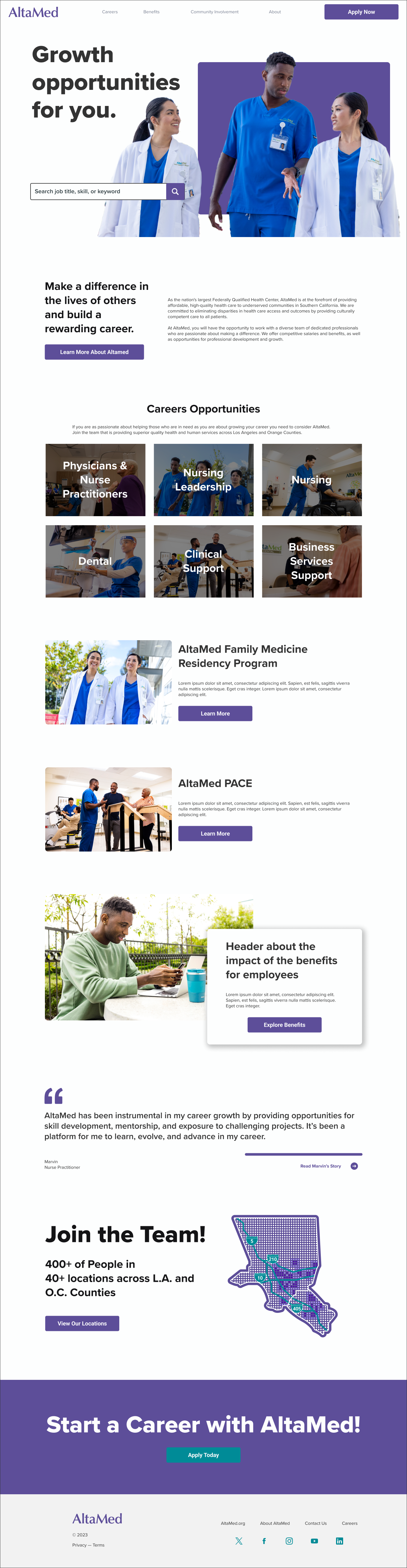
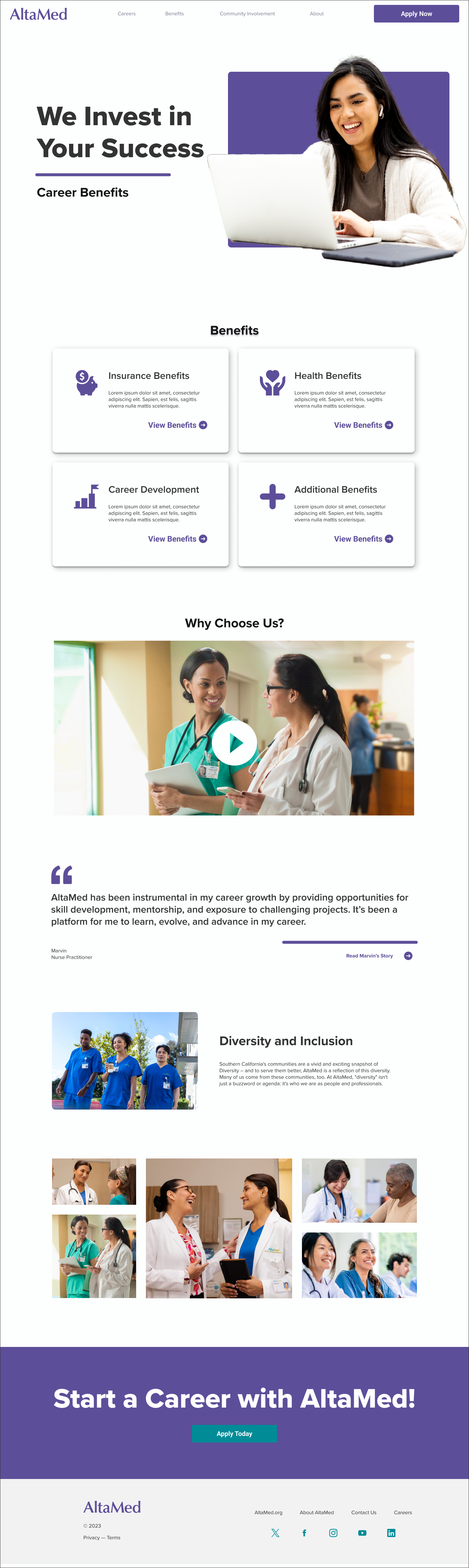
Before creating the website, I developed a content guide outlining the website's structure. The content guide influenced the sitemap, where I laid out the pages, considered information hierarchy, and envisioned how users would navigate through the website.
The content guide was centered around pillars that inspired the pages in the recruitment site.
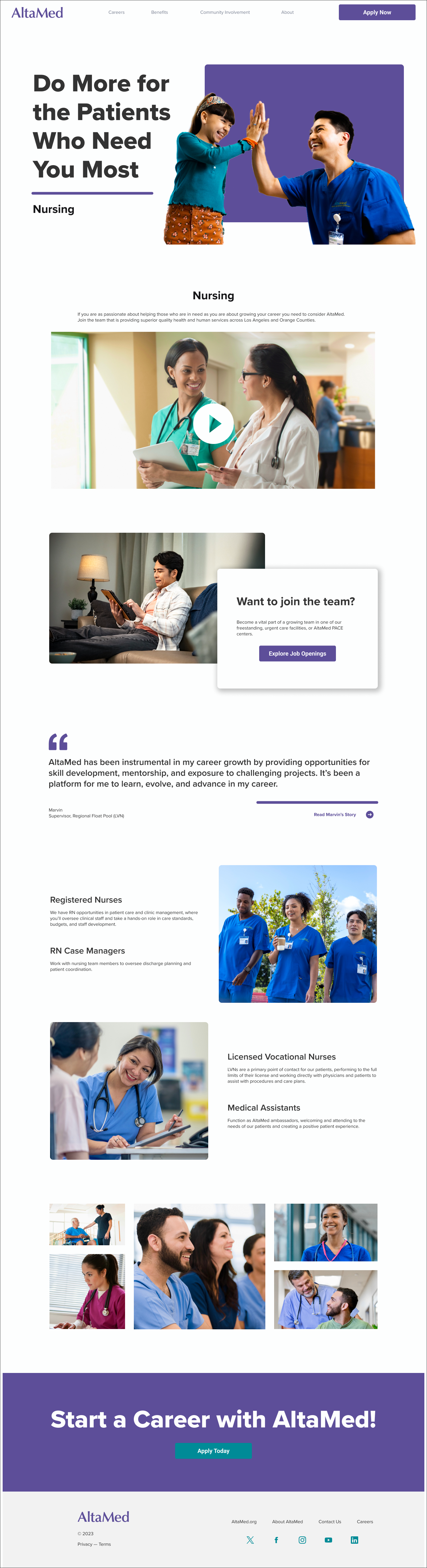
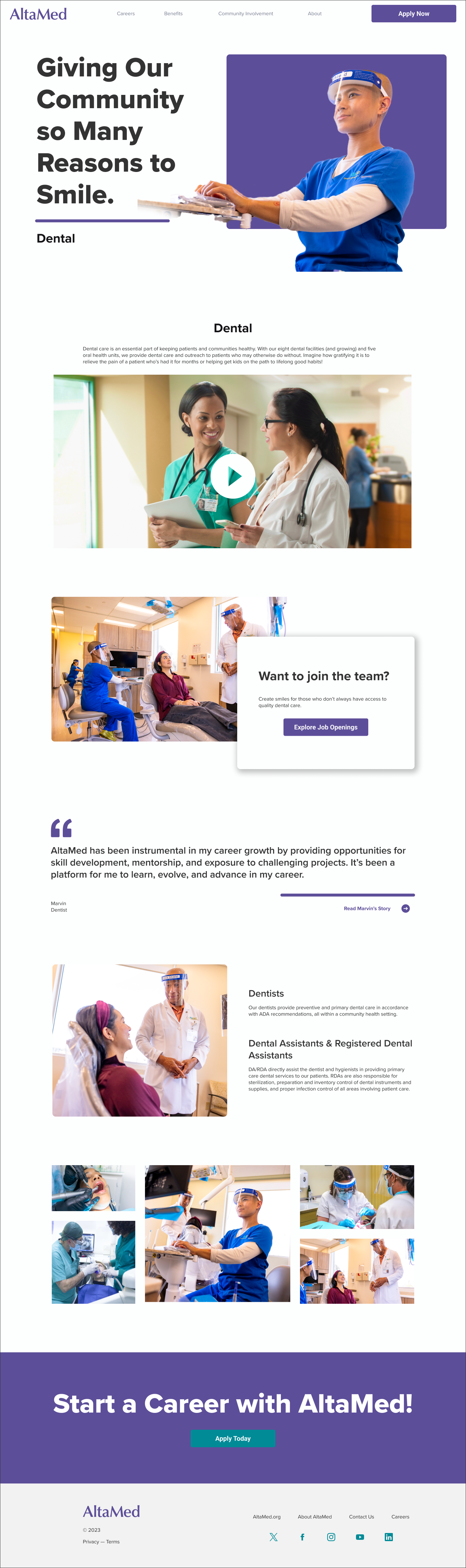
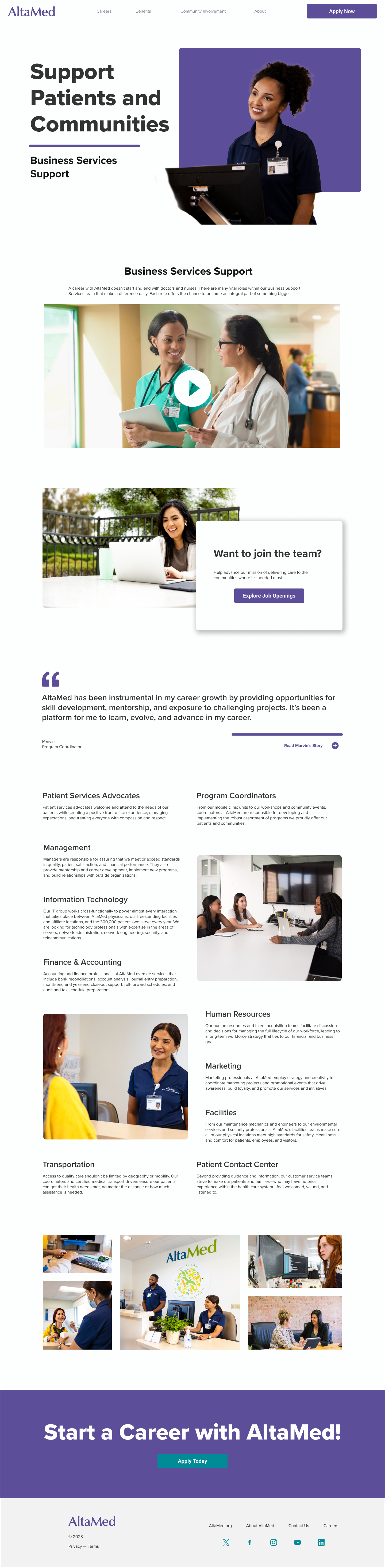
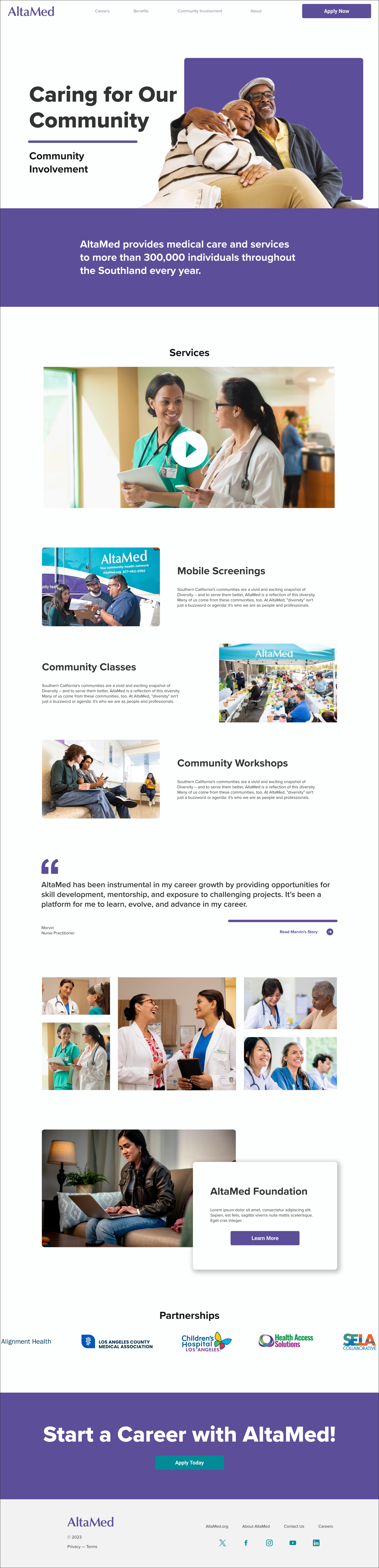
I created sketches and developed low-fidelity, mid-fidelity, and high-fidelity versions of the wireframe. It was important to me to keep it simple and digestible with good hierarchy so that potential employees could easily access all the information they wanted.
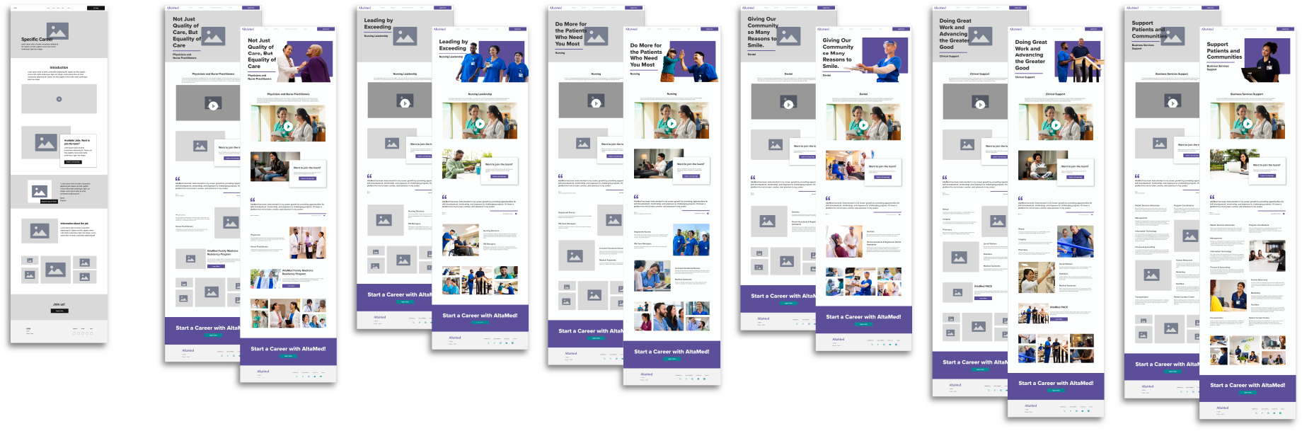


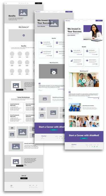
Some features different from the landing page that add to the experience are:
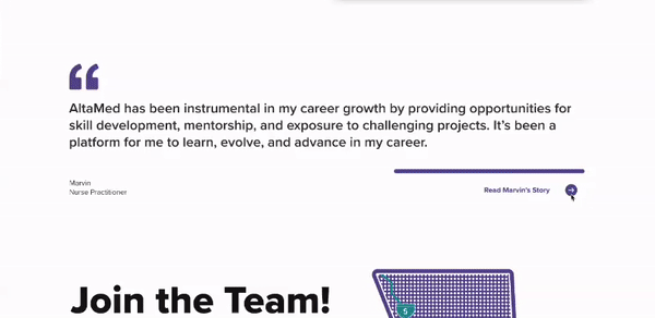
Testimonials
To foster emotional connections with potential employees, I have incorporated a testimonial from a current employee, offering the option to read their story. By clicking 'Read the person's story,' an overlay appears on the webpage, revealing a short backstory of the employee and how AltaMed has positively impacted them.
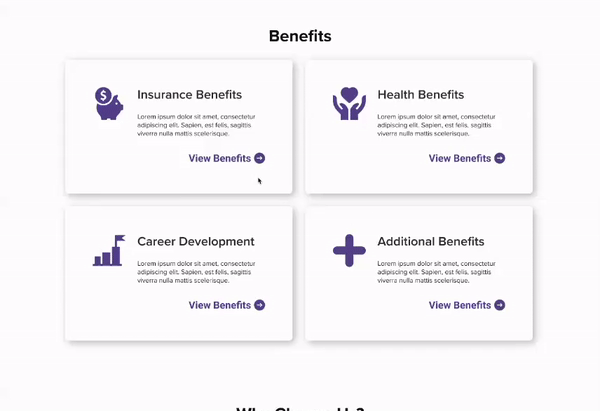
Benefits
Benefits are grouped into four categories. By clicking 'VIEW BENEFITS,' the benefit category expands to show the list of benefits that coincide with that category.
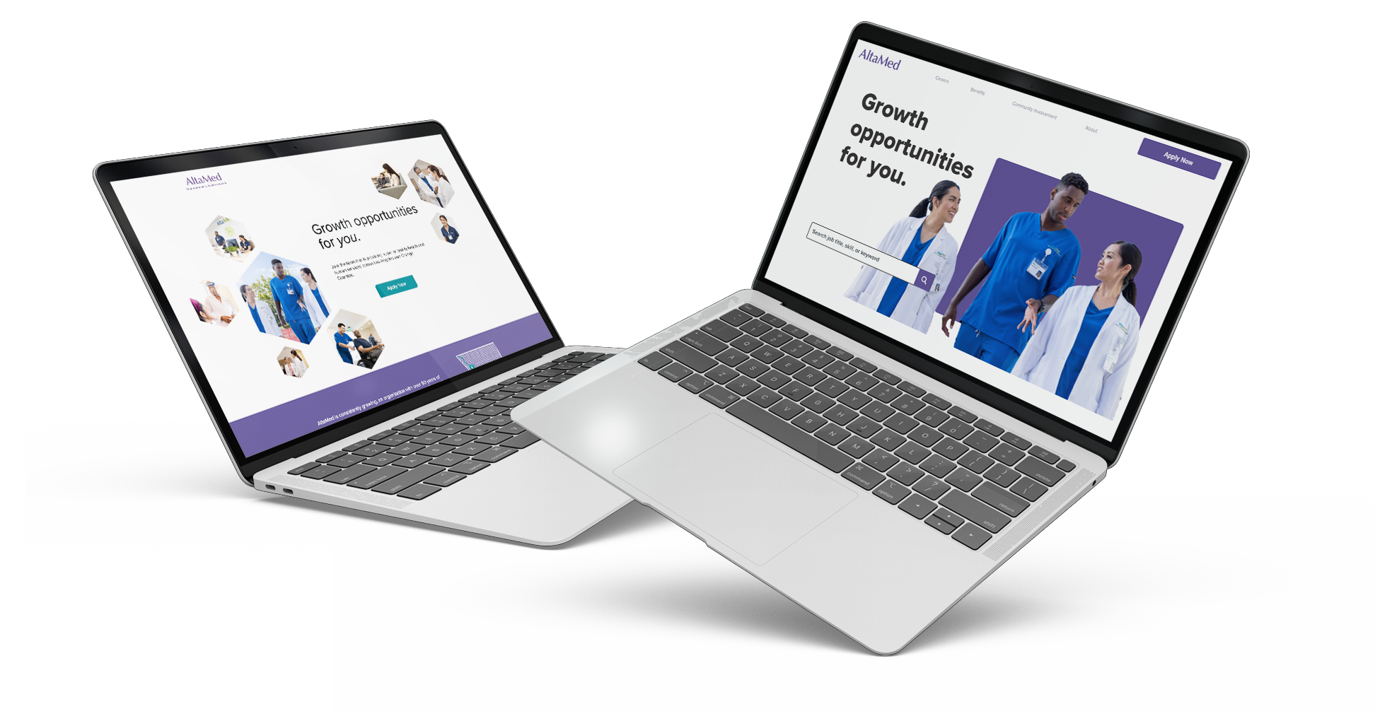
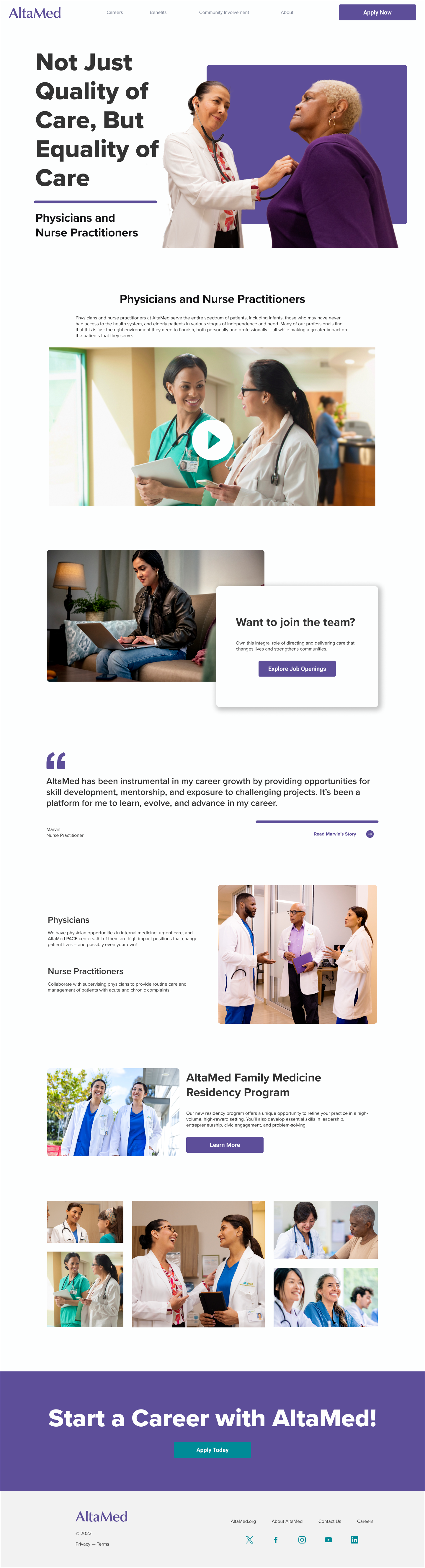
I created a high-fidelity prototype of the website to inspire the live website.
Due to technical constraints and shifted priorities, the live website had to be accelerated, and some of the elements I designed had to be adjusted. However, the spirit of both the initial landing page and the subsequent high-fidelity wireframe are represented in the final site which is coming soon!
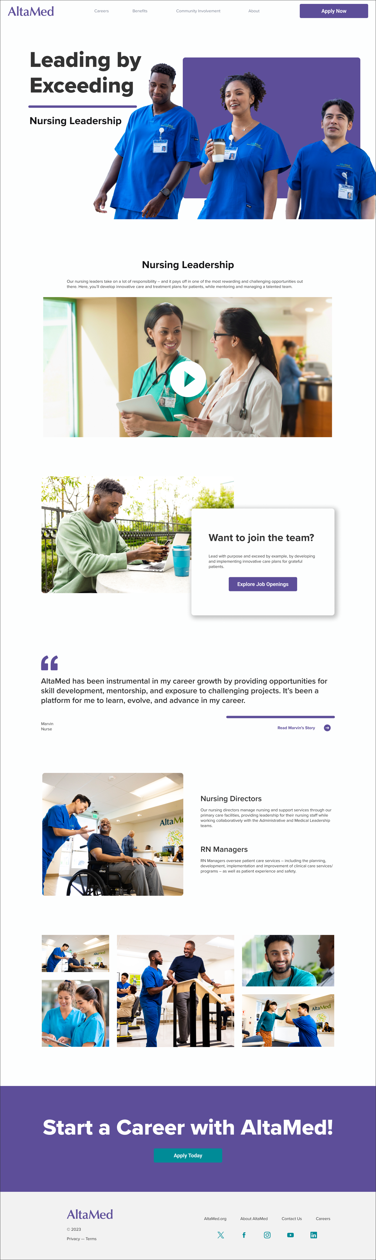


AltaMed is one of Sensis's longtime clients. Regularly participating in internal reviews and seeking feedback from designers and people across various teams was essential for understanding the client's needs from those who had worked with them for longer. Incorporating elements that balanced clients' preferences with research findings also worked.
The importance of labeling buttons with specific and descriptive labels to maintain 508 accessibility compliance.
I am happy with my high-fidelity prototype; I like the bold typeface and image treatment. Next time, I'll keep my design closer to what I created for the landing page. At the time, I thought that using similar elements but creating a bolder design would be better. However, I now believe that sticking to the small frame preapproved by the client would have streamlined the approval process more effectively.