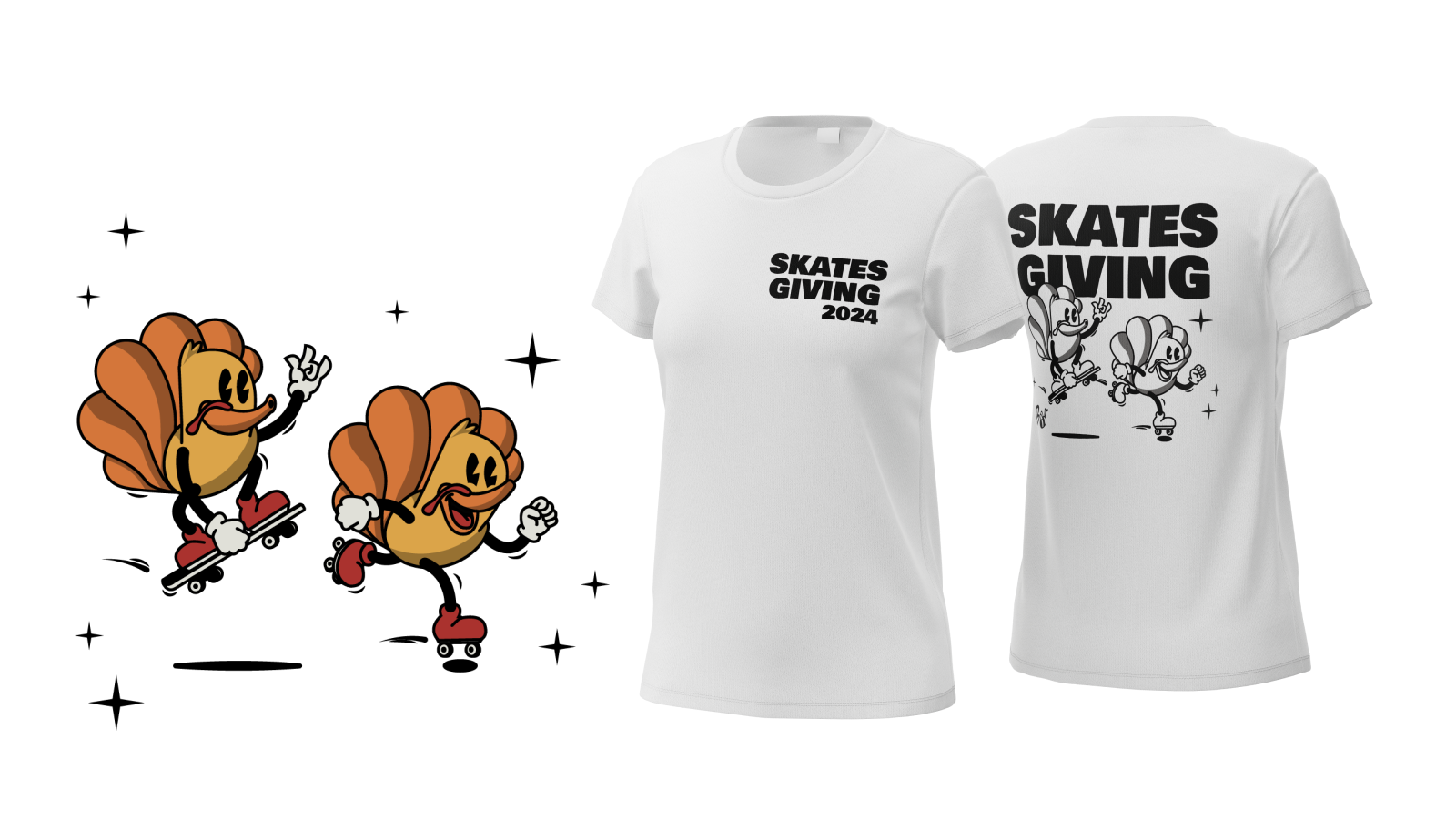

Skate Hunnies
Graphic Designer
Promotional material and logo refresh for the Skate Hunnies' annual Skatesgiving event.
SKILLS DEVELOPED
Branding, Illustration
TOOLS USED
Adobe Illustrator
Skateboarders, Roller and inline skaters of all ages and skill levels
1. Capture attention, communicate key details, and increase event attendance.
2. Develop a refreshed logo for use on the flyer and merchandise, establishing a recognizable event identity for this and future years.
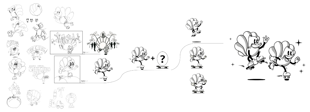
Drawing inspiration from 1930s retro cartoons, I developed a lively and recognizable character for this project. The character's dynamic pose conveys a sense of movement and excitement, suggesting the event is a race without appearing overly competitive. This visual identity, featuring a refreshed logo and poster, can be used consistently year after year, ensuring brand recognition and a strong visual presence.
I focused on developing a dynamic and bold typeface that visually communicates a sense of speed and momentum.
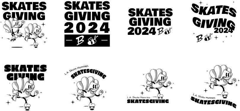
The design objective was to create a visual identity that conveyed a playful, festive, and welcoming atmosphere. The overall aesthetic should be approachable, emphasizing the event's silly and energetic nature while encouraging broad audience participation.

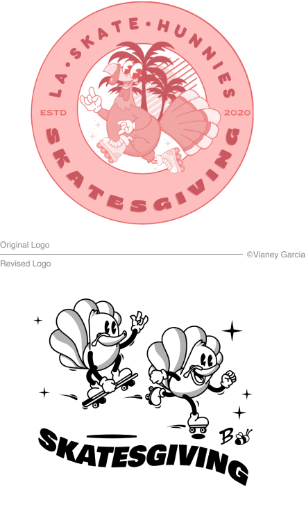
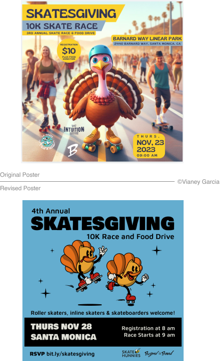
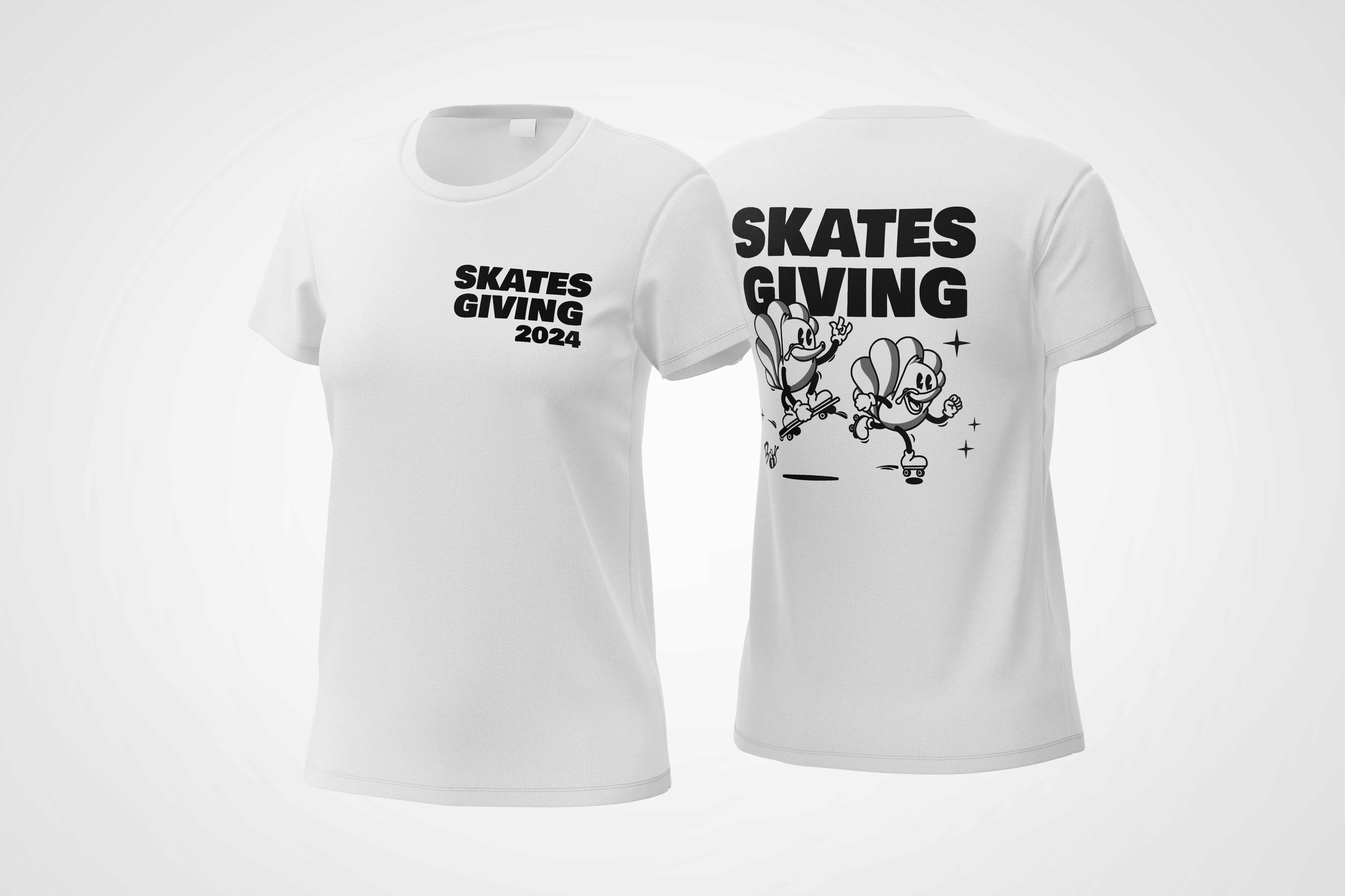
This project provided a valuable opportunity to hone my illustration and character design skills. I enjoyed the development process and navigating the challenge of creating a recognizable turkey while avoiding a strictly Thanksgiving aesthetic
While at times my design direction differed from the client's final preference, the process emphasized the importance of client collaboration and understanding their unique vision
In future projects, I will dedicate more time to thorough planning, potentially implementing a sprint methodology with a dedicated day for ideation to allow for more extensive refinement of the final design.